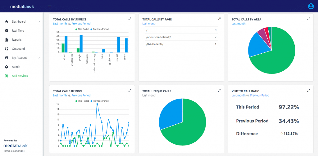
Hot new design for Mediahawk
Based on customer feedback, we’ve given our user interface a makeover. Reporting and analysing your calls just got even more intuitive, speedy and easy to use.
A good user interface is simple, quick and intuitive, plus it makes it easy for users to get the information they need for their work, and our customers have been our greatest help in guiding us. Now, we’re putting all that valuable feedback into action, so today, we’re presenting a new user interface centred around improving the overall Mediahawk experience.
What’s changed?
When you join Mediahawk from today, you’ll be analysing your call data with a:
- Slick, new modern look and design
- More intuitive user experience
- Full dashboard and report customisation
- Improved report filtering
- Faster reporting speed
- Better access to key information
- Cleaner and quicker report views
How did we decide on this new design?
Our Product, Client Services and Marketing teams have been hard at work researching how our customers interact with Mediahawk on a daily basis. Our customers have shown a great deal of support in helping us uncover some of the less user-friendly parts of Mediahawk and we’ve used that information to improve our customer workflows.
We got a lot of great feedback about Mediahawk’s ease of use, so we haven’t changed the structure or setup of any features. Instead, we focused on smaller user experience changes that we hope will help with more efficient reporting within accounts.
New and Existing customers
All new customers will be introduced to the new design immediately and existing Mediahawk customers will be transitioned over the next few weeks.
There’s more in the pipeline
We’re very excited about the new changes and hope you will enjoy using Mediahawk with its fresh new look. This is just the first of many planned improvements to the product over the coming months.


